Integrail
Wellness & Longevity Brand
Services:
Branding, Website
Branding, Website
Client:
BuildDojo Design
BuildDojo Design
Year:
2023
2023
Concept
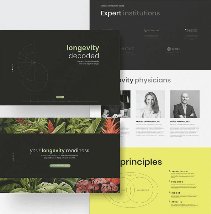
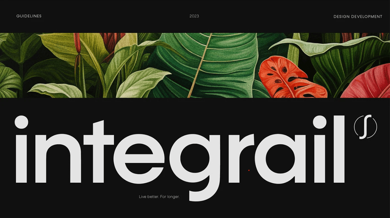
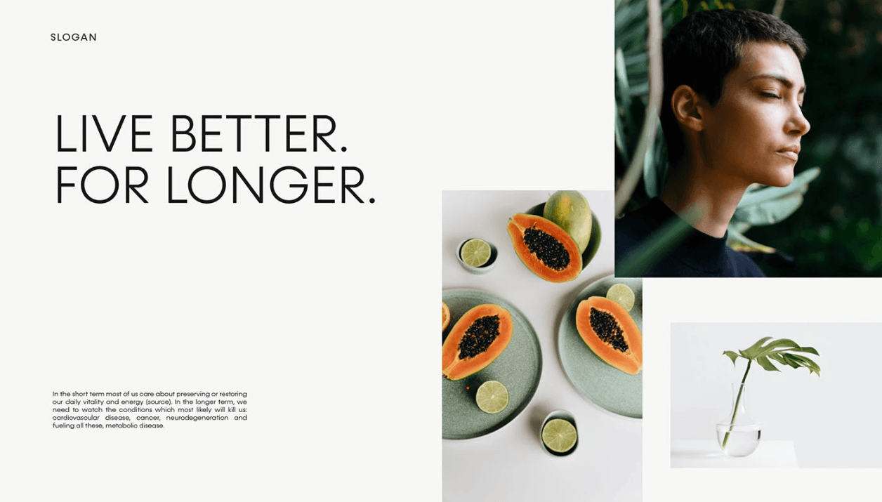
Integrail is a wellness and longevity brand designed to inspire a deeper connection to health, vitality, and modern living. The brand merges holistic principles with a forward-thinking aesthetic, using bold typography and a refined palette to convey strength, clarity, and balance. From digital touchpoints to brand assets, the identity reflects a commitment to long-term well-being — both physical and mental.
Challenge
The challenge was to create a visual identity that felt scientific yet human, premium yet accessible. It needed to stand apart in a saturated wellness space, communicating trust, innovation, and longevity without relying on clichés. The typography and colour system had to support both brand recognition and readability across web and print.
Solution
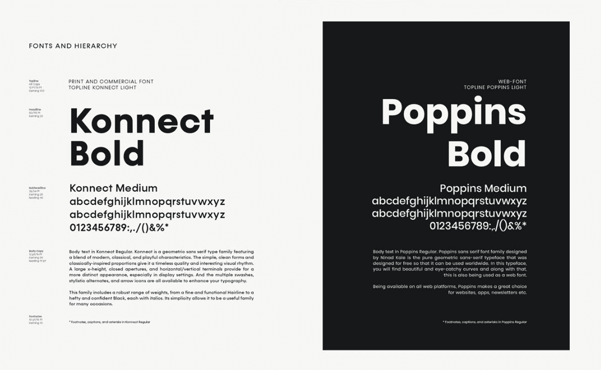
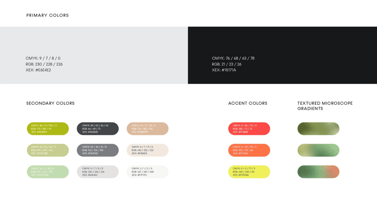
I built the identity around Konnect Bold and Poppins Bold to emphasize structure and clarity, paired with a colour system that blends calm neutrals and vibrant accents. The visual direction balances modern minimalism with grounded, organic tones — delivering a clean, confident look across the website, packaging, and editorial materials. The result is a brand that feels intelligent, supportive, and built to last.
Concept
Integrail is a wellness and longevity brand designed to inspire a deeper connection to health, vitality, and modern living. The brand merges holistic principles with a forward-thinking aesthetic, using bold typography and a refined palette to convey strength, clarity, and balance. From digital touchpoints to brand assets, the identity reflects a commitment to long-term well-being — both physical and mental.
Challenge
The challenge was to create a visual identity that felt scientific yet human, premium yet accessible. It needed to stand apart in a saturated wellness space, communicating trust, innovation, and longevity without relying on clichés. The typography and colour system had to support both brand recognition and readability across web and print.
Solution
I built the identity around Konnect Bold and Poppins Bold to emphasize structure and clarity, paired with a colour system that blends calm neutrals and vibrant accents. The visual direction balances modern minimalism with grounded, organic tones — delivering a clean, confident look across the website, packaging, and editorial materials. The result is a brand that feels intelligent, supportive, and built to last.